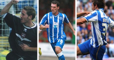
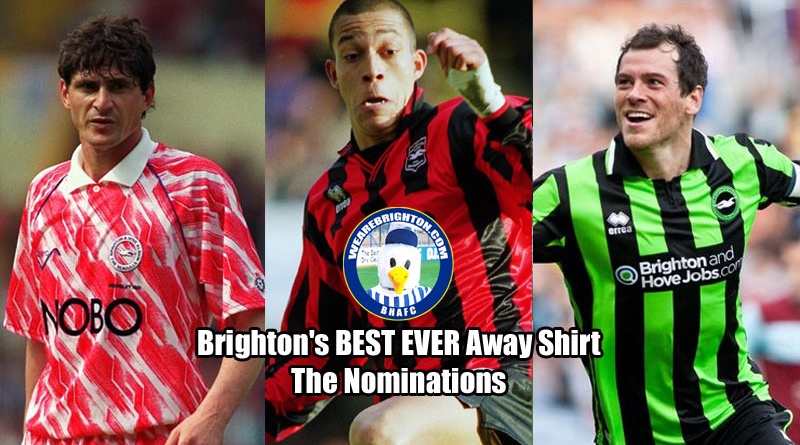
Brighton & Hove Albion Best Ever Away Shirt: The Nominations
We’ve gone BIG for our next WeAreBrighton.com Lockdown Tournament. Due to popular demand, we’ll be looking to crown Brighton & Hove Albion’s Best Ever Away Shirt and because there are so many candidates, we’ve extended the competition to contain 32 entrants.
That’s a sign of the high-quality of away shirts that the Albion have been blessed with through the years. While there is only so much that you can do when it comes to innovative designs and blue and white stripes, away kits are something of a blank canvas.
Through the years, Brighton have worn yellow, red, white, black, green, orange, even a Chewitt Wrapper. There was also that strange season when Dick Knight decided to design two away kits which both featured blue, completely disregarding what would happen when we met any one of the 11 other League One sides who also wore blue.
In other words, we’re spoilt for choice. And that is what makes a tournament to crown Brighton’s Best Ever Away Shirt so exciting – because nobody knows who will win.
The 32 candidates will be split into eight groups of four. As with our Worst Ever Performance and Best Ever Home Shirt Tournaments, voting will then take place on Facebook and Twitter, the scores for each shirt across the two platforms will be pooled together and the top two from each group will progress to the knockout stages.
There will be a second round, quarter finals, semi finals and final from there. The first group stage will get underway on Friday morning.
In date order, here are the nominations:
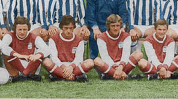
The Arsenal Away Shirt 1960s
Hands up who knew Brighton once sported an Arsenal-inspired away kit in the late 1960s and early 1970s? No, us neither until we came across it on the brilliant Goldstone Wrap blog. Very little is known about the kit and Albion fans of a certain vintage can only recall it being worn sporadically, including against Chelsea in an FA Cup tie in 1967 and at Bristol Rovers in the 1971-72 season. We couldn’t NOT include it. It’s fantastic.
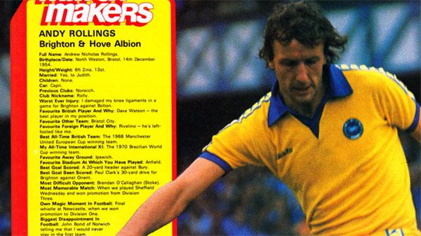
Bukta Away Shirt 1977-1980
The blue and white Bukta home shirt went all the way to semi finals in our Best Ever Home Shirt tournament and we’re expecting similarly good things from the yellow away number that went with it. Worn between 1977-80, its simplicity is what makes it so stunning. Yellow with a pattern of blue Seagulls down the sleeves, it was of course worn on the day when Brighton won 3-1 away at Newcastle United to secure promotion to the top flight for the first time ever.
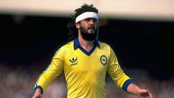
FA Cup Semi Final Shirt 1980-1983
Adidas had six seasons as Brighton’s kit supplier in which time they produced one yellow kit. Just like everything the German manufacture did, it was beautiful. A yellow design with the famous three stripes associated with the company in dark blue and a very 1980s floppy collar. Although it was worn for three Division One seasons, it will always be associated with one famous afternoon in Albion history – the 1983 FA Cup Semi Final victory over Sheffield Wednesday.
White Adidas Shirt 1983-1985
If you are a football shirts aficionado then another must-bookmark site is Old Football Shirts, which is where one of the only photos in existence of Brighton’s second Adidas away shirt can be found. This is a kit which seems to have been forgotten with the passage of time – a bloody crime to be honest as it’s stunning. White with red and blue pin stripes, it was worn in the 1983-84 and 1984-85 seasons in conjunction with the delightful blue home shirt of the same design.
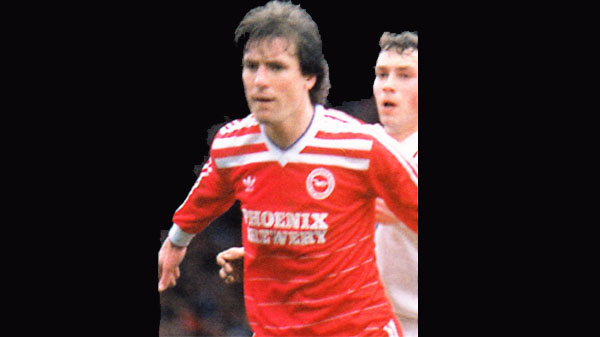
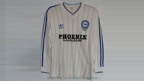
Red Phoenix Brewery Shirt 1985-1987
Adidas’ final away shirt was the best of three pretty great efforts during their association with Brighton. The blue and white home version of this ended up winning the Brighton Best Home Shirt Tournament, so the red version will be under pressure to live up to’s counterpart. Worn between 1985 and 1987, if one of these appeared on eBay then you’d sell your own kidney without a second thought to get your hands on one – and probably your wife’s too.
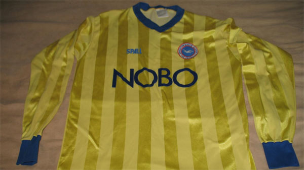
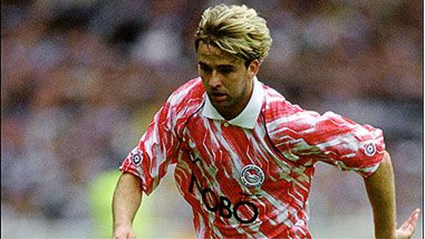
NOBO Banana Shirt 1987-1990
Another shirt from the Old Football Shirts archive, this effort from Spall incorporated two different shades of yellow into stripes. Newcastle United had a similar away kit in 2009-10 which was nicknamed the banana kit and got plenty of attention for being so garish; few people realised or recalled that the Albion had beaten them to it 20 years earlier. It should have been remembered given it was worn at Selhurst Park when Crystal Palace and Brighton shared five penalties in a single game.
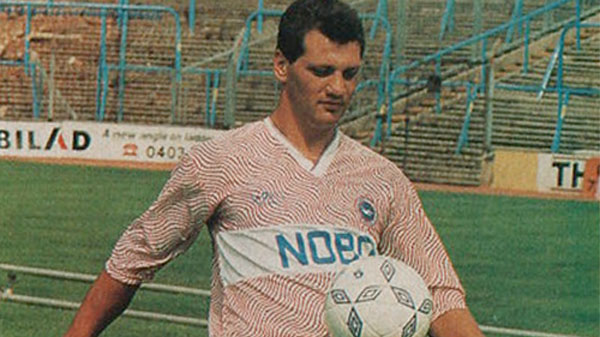
Pink NOBO Shirt 1989-1991
The late 1980s were a far less tolerant time, which makes it absolutely astounding that somebody thought it would be a good idea to have a football team from Brighton wear a pink kit and white kit in a frilly pattern and emblazoned with NOBO in huge letters across the front. We’re glad they did though as the Pink NOBO Kit worn between 1989 and 1991 has quite rightly gone onto gain cult status in the intervening 30 years. A real contender for the title of Best Brighton Away Shirt.
Chewitt Wrapper Shirt 1991-1993
Trying to follow on from the Pink NOBO Kit with something more outlandish should have been an impossible task. Fair play to Ribero, who somehow managed to produce a shirt even more ridiculous. Lovingly nicknamed the Chewitt Wrapper, it debuted in the 1991 Division Two Play Off Final defeat to Notts County and was used for the next two seasons. At the time, it was the subject of much mockery but is now quite rightly considered a classic. One of the favourites.
Inter Milan Shirt 1994-1995
With Liam Brady’s appointment as Brighton manager, Admiral brought out a blue and black striped shirt inspired by Brady’s links with Inter Milan. From the first moment that Albion fans saw it, it’s been considered one of the best ever away kits. Which makes it even more of a travesty that it was only used twice in competitive action; away at Swansea City on the opening day and in the annual defeat at Brentford. Curse Division Two for having so blue wearing teams in the 1994-95 season.

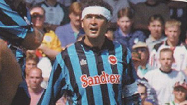
Red Sandtex Shirt 1994-95
An away fixture with blue-wearing Wycombe Wanderers highlighted the practical difficulties Brighton were going to face in the 1994-95 season with a blue and white home shirt and a blue and black away shirt. The solution was to produce this red kit, which might have been unremarkable if not for the fact that the sleeves seemed to have been designed by somebody on acid. It’s certainly different and best remembered for being worn when Jimmy Case was sent off for being deaf.

Yellow Black Sandtex Shirt 1995-1997
Admiral must have had a fetish for producing strange sleeve designs in the mid-90s. Taking over from the red shirt with the drug-hazed pattern came a yellow away kit which featured a small black chequered chess board area over the right shoulder and on the right sleeve. Nobody has ever been able to offer a suitable explanation about what that was all about. Another shirt that seems to be looked back on much more fondly than it was at the time.
AC Milan Shirt 1999-2002
Five years after the Inter shirt, Errea marked their first season with Brighton by looking to Milan’s other club with the AC Milan Away Shirt. The result was stunning, a red and black striped shirt that was so popular that it lasted three seasons and has been copied twice in the intervening 20 years. Not only did Brighton win two divisional titles wearing it, but they looked bloody incredible doing so. The bookies’ favourite to be crowned the Best Away Shirt in Brighton history.
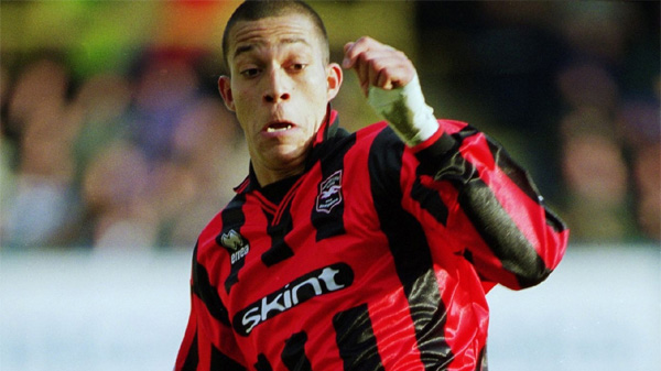
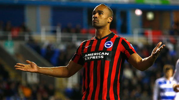
Batman Shirt 2002-2004
Quite how the Batman Shirt received multiple nominations to be included in the Brighton’s Best Away Shirt tournament is an absolute mystery to us here at WAB Towers. This all back number was used between 2002 and 2004 and was meant to have the outline of a white seagull across the chest; instead, it ended up with either a heavily pregnant seagull or a bat, depending on your viewpoint. Lots of you seem to like it though and so here it is, straight out of Wayne Manor.

Yellow and Brown Seagull Shirt 2003-2005
Brighton returned to their classic away colours for the 2003-04 season with an uncomplicated Errea shirt which was literally just yellow. Except for the badge, which was replaced by a lone black Seagull sewn into the shirt which turned brown after five washes. This unintended feature is what always gets talked about when discussion turns to this kit, but it was still pretty neat in its own right.

Palookaville Shirt 2004-2006
The Palookaville Shirt was originally meant to be worn as a one-off special to promote Fatboy Slim’s new album of the same name in a home game with Sheffield United in October 2004. It was so good though that the Albion opted to use it as a third choice kit throughout the remainder of the 2004-05 seasons and into 2005-06. It was made from figure-hugging material, but somehow managed to looked cool even when clinging tightly to the belly of the most rotund Albion supporters.

Maroon Shirt 2005-2007
We love the story of how the maroon kit was born. Dick Knight gave supporters three designs to vote from for the 2005-06 kit, two maroon variations and one green and black stripes. Given that all the Albion’s new training gear was maroon, he clearly had decided who he wanted to win. Except Brighton fans didn’t agree, the green and black secured the most votes and so Knight desperately claimed maroon had in fact won because it was the most popular colour between all of the choices. We haven’t had a new kit vote since, funnily enough.
Palace Away Shirt 2005
Ahead of Brighton’s trip to Crystal Palace in October 2005, all thre kits at the time – the Argentina home shirt, the Palookaville Shirt and the Maroon Shirt – clashed with the Eagles’ red and blue stripes. And so this one-off white version of the maroon kit was produced for that memorable evening at Selhurst Park when Paul McShane’s header gave the Albion a 1-0 win over their arch rivals. A nice shirt that will always be associated with a brilliant evening.

Brazil Shirt 2007-2008
When the Albion unveiled their new away kit for the 2007-08 season, the combination of yellow shirt with blue trim, blue shorts and white socks looked very Brazil-esque. A half-decent League One side copying the kit of the Seleção was always likely to be a bold move and the blue shorts and white socks were quietly ditched a few months into the campaign in favour of all yellow. The shirt has always been pretty underrated in our book.
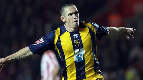
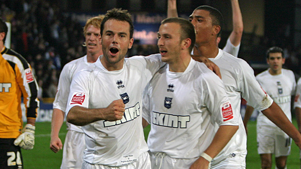
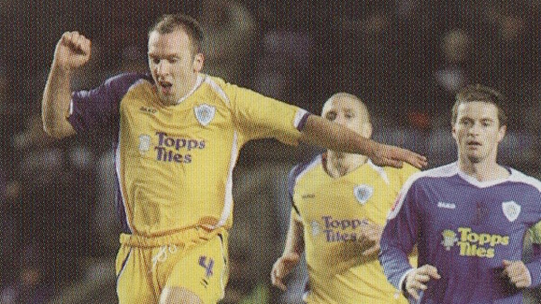
Yellow & Blue Striped Shirt 2008-2010
This was a shirt that seemed to divide opinion like few other Brighton away kits have – you either loved or you hated it. Here at WAB Towers we were firmly in the love category. Yellow and dark blue is a great combination, it was unlike anything we’d ever had before and the badge being transformed into the colour of the kit set a nice precedent for Errea kits going forward. It also conjures up happy memories of Gus Poyet’s first game in charge and the birth of the modern-day Albion.

Coventry Shirt 2008-2009
The Yellow & Blue Striped shirt was the Albion’s first blue away kit for the 2008-09 season. The second blue away kit for that campaign was this Coventry City inspired number. Goodness knows where the idea to copy the mighty Sky Blues came from, but it wasn’t exactly a success – highlights in this shirt included being knocked out of the Paint Pot by bottom of the Football League Luton Town. Somebody obviously liked it though, unless it was nominated as a joke.

White ‘One-off’ Shirt 2008-2011
Anyone with a half a brain could have seen the problems that were sure to arise for a club with three blue kits when they met opposition who wore blue. The predictable happened when Brighton went to Shrewsbury Town in the Paint Pot. Sky said they had to find a new kit that wasn’t blue to avoid confusing the watching nation and as a result, this white shirt was rushed out as a “one off”. It would go onto be used twice more, at Millwall in League One two months later and in the 2010-11 season at Dagenham & Redbridge.
Leicester City’s Away Shirt 2009
Now this is definitely a joke nomination, but it was such a ridiculous turn of events that it makes the cut. The three blue kits situation reared its ugly head again at Leicester City in January 2009 where, unsurprisingly, the referee wasn’t happy about the clash between the Foxes’ blue and Brighton’s yellow and blue. Cue the Albion having to borrow Leicester’s quite nice away kit. Micky Adams’ side drew 0-0 too with the eventual League One champions. Perhaps we should have worn Leicester’s shirts ever week?
AC Milan Version Two Shirt 2009-2011
A decade on from the much-loved first AC Milan away kit, Errea returned to the format with this red and black stunner. The weird swirl on the right side of the shirt gave it a modern day look and although it wasn’t quite as popular as its forerunner, it’s still Italian sports design at its very best. God, I miss Errea.
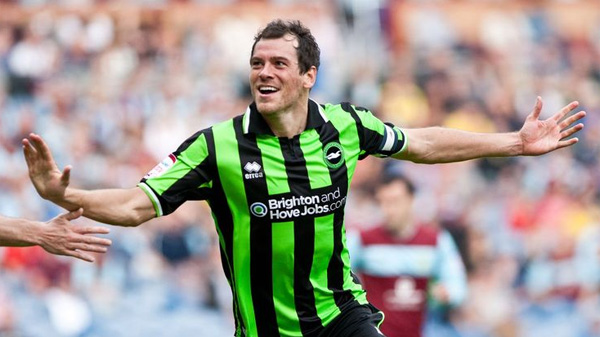
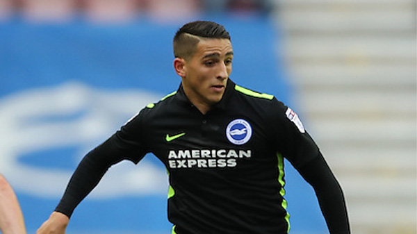
Green & Black Striped Shirt 2011-2013
Another reason to miss Errea is the away kit from the first season at the Amex – which for our money is the best Brighton away shirt ever. Bright green, black stripes, another club badge transformed using the colours from the kit. You don’t often see supporters wearing away shirts to home games, but this was so good that there were nearly as many green shirts dotted around the stands at the Amex as there were blue and white. Another of the bookies’ favourites.
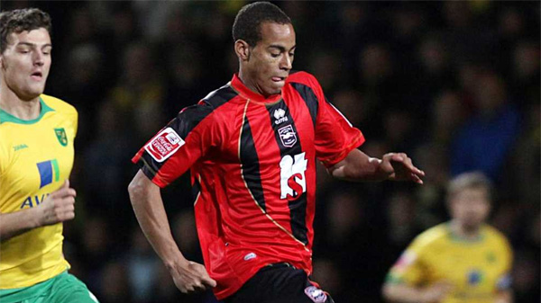
Oscar Garcia Away Shirt 2013-2014
Until we opened up the selection process for our Best Ever Brighton Away Shirt Tournament, we never knew quite how popular the Oscar Garcia season away shirt was. The yellow with dark blue pinstripes was certainly a neat design, but it received nearly as many nominations as AC Milan and Green & Black Striped shirts. Most famously associated with Leonardo Ulloa scoring THAT goal at Nottingham Forest, this could be a dark horse for the title.
Nike AC Milan 2014-2015
We’re into the Nike Era now and while their five home shirts to date have been nothing to shout about, their away efforts haven’t been too bad – even if they have all been template kits. Nike’s first away shirt was Brighton’s third AC Milan kit. It was simple and effective, even if the ironed-on sponsor caused some Brighton fans to turn into Trinny and Susanah with their fashion critiques.
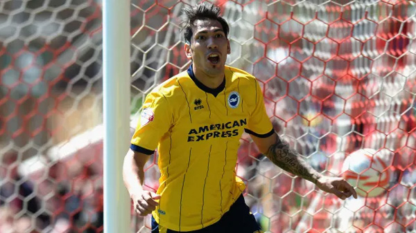
Orange Nike Shirt 2014-2015
The Brighton marketing bods billed the Orange Nike number as a special edition kit which only the luckiest fans could own; ironic given that you could buy the exact design for a tenner from the Nike store and stick your own Brighton badge on it. In fact, it was the most used kit in the Sussex Sunday League in the 2014-15 campaign. That so many Albion fans were desperate to fork out £60 to get their hands on it despite this shows you how popular an away shirt it was.

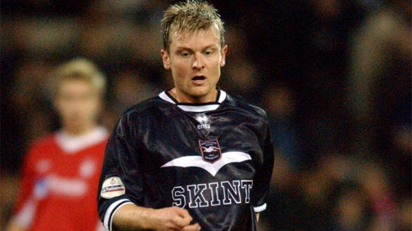
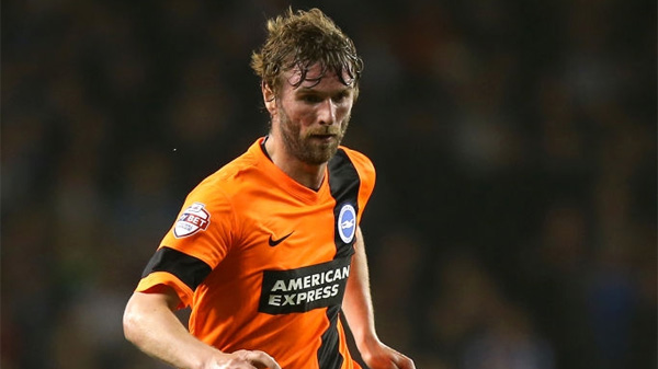
Volt & Black Shirt 2015-2016
We’re five years on from the release of the Volt Shirt and still nobody knows what colour it actually was. Was it yellow? Was it green? And if you were colour blind, you had absolutely no idea. It was another template effort from Nike, available for £15 for the Dog & Duck Reserves and £60 when a Brighton badge and American Express logo was added. Even so, it was still one of the better away kits of recent seasons.
Black & Volt Shirt 2016-2017
Clearly, a lot of thought went into the design process for Brighton’s 2016-17 away kit as Nike simply decided to reverse the colours of the previous season’s shirt. Volt with black trim became black with volt trim. It will be forever associated with the Albion’s Championship promotion season and it can probably expect to do very well based on that alone.
University Gold Shirt 2017-2019
The away shirt for Brighton’s first season in the Premier League was officially billed as ‘University Gold’. To the untrained eye, it was more like yellow with vomit green coloured sleeves. That doesn’t make it sound great, but it actually worked. The traditionalists were also appeased given that yellow was the colour worn the Albion wore in their top flight debut season some 38 years earlier. A nod to the past.

Green Nike Shirt 2018-2020
Another surprising nomination given that last season’s away kit was widely panned last season. There were even reports that the players had asked not to wear it after November because they disliked it so much. It returned in February and had a pretty decent outing at Selhurst Park in March, that 2-1 win over Crystal Palace perhaps being responsible for the new-found popularity of the green kit.

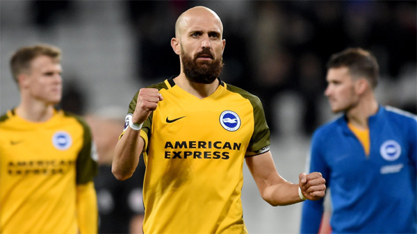
Charcoal Nike Shirt 2019-2020
Our 32nd and final entrant is the 2019-20 away kit. It isn’t black, it’s charcoal. It’s very popular too and we are particularly fond of the Brighton badge being in the same colours as the kit, ala the great Errea shirts of the first half of the 2010s. It was worn when Brighton secured their first ever three points away at a big six club at Arsenal in December. Who knows, it might claim some more famous scalps should football ever resume.
Keep an eye on both our We Are Brighton Facebook page and our We Are Brighton Twitter feed to cast your votes for Brighton & Hove Albion’s Best Ever Away Kit.