The evolution of the modern Brighton kit
One of the most treasured rituals of following any football team is getting kitted out ahead of the new season in the latest replica design.
Since their introduction in the 1960s and 70s, replica jerseys have become a mainstay of terrace couture. Brighton is no different, with the banks of the Amex a sea of blue and white.
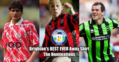
Inevitably, some designs prove more popular than others, and in this article we will discuss the home kits worn by the club’s players and fans since the turn of the century.
2000s
Brighton started the new century with a traditional design that featured the now iconic ‘skint’ sponsor logo. The record company, which is based in the city, was a key feature of the home kit for a full seven seasons, and a source of amusement for rival fans who made light of the word’s other connotations.
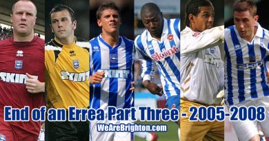
Kits for the first three years of the decade, manufactured by Errea, who would remain in position as kit manufacturer all the way through to 2014, were fairly traditional affairs. But that pattern was broken in 2004 with the introduction of much paler blue stripes.
This paler shade hadn’t previously been seen on a Brighton kit and it would split opinion, while the over-sized adapted Seagull logo in the centre of the shirt was also marmite among supporters.
Normality would return two years later and the club would close out the decade in a much more traditional ensemble, with local tech company IT First replacing Skint Records after a nine-year sponsor partnership.
Fat Boy Slim wearing his Skint Brighton shirt pic.twitter.com/EI2TyCOkua
— Classic Football Shirts (@classicshirts) November 15, 2016
2010s
IT First’s backing would last just a couple of seasons before the brand was replaced by Brighton and Hove Jobs – a single season partner whose logo was laid over another traditional design paired with blue shorts and gold trim for the club’s first season at Falmer in 2011-12.
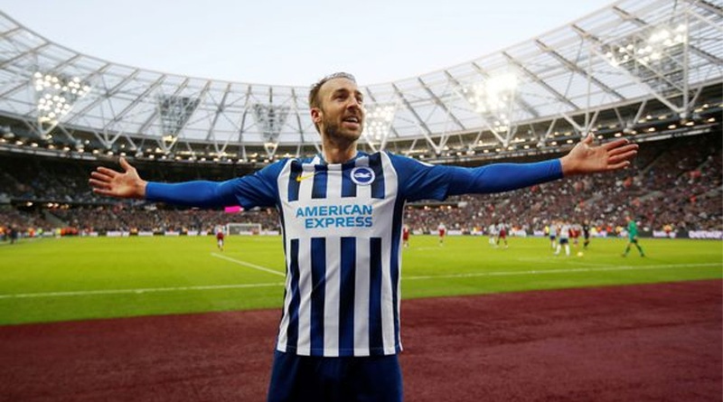
2013 would see things change again and mark the start of a lucrative, long-term partnership with American Express. The credit card company has since leant its name to the Seagulls’ new stadium and their logo has been a mainstay on Brighton kits ever since.
Errea were replaced by Nike as kit manufacturer a year later as the club ramped up its commercial activities ahead of a tilt at Premier League football.
Since taking over responsibilities for the kit, Nike have experimented with blue shoulders and more classic designs, with the 2016-17 kit that saw the Seagulls promoted enjoying a special place in the club’s history.
Designs revealed since then have generally been warmly received by supporters as the club consolidated its position in the top flight, with last year’s contrast black and blue stripes offering a bold change of direction
.
Brighton's new home kit is 🔥🔥🔥 pic.twitter.com/sD4PB6fDsn
— Goal (@goal) May 28, 2019
The present day
The Seagulls were reasonably priced to progress on last season’s showing as they headed out for the 2020-21 season. This year’s shirt is predominantly blue and represents a significant departure from the more traditional stripes of previous years.
The new design doesn’t appear to have brought much good fortune so far, however, and anyone who bets on football will tell you that our odds for relegation have shrunk since the opening day following a cagey start to the campaign.
Brighton are priced at 6/1 in the latest markets to suffer demotion to the Championship, although Sheffield United, Burnley, West Brom, Fulham and Newcastle are all priced as being more likely to finish in the bottom three.
But whatever the outcome of this season, and wherever the Seagulls find themselves in upcoming campaigns, the club’s kit will undoubtedly remain a huge part of fan culture for many generations to come.